For personal branding, there are two major different logos I use depending on the context of what the content of a blog post is about. If I am talking about LGBTQIA topics, then the obvious choice is the progress flag. The following flag is an image I designed in Inkscape, and I use it on many of my social media sites so that people will know that I am one of the rainbow people. In fact, it’s quite effective because I get a lot of people flooding my comments on Instagram as a reaction to my profile picture. The colors are brighter than what you will see on other flags and were chosen for my autistic mathematical satisfaction.

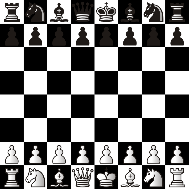
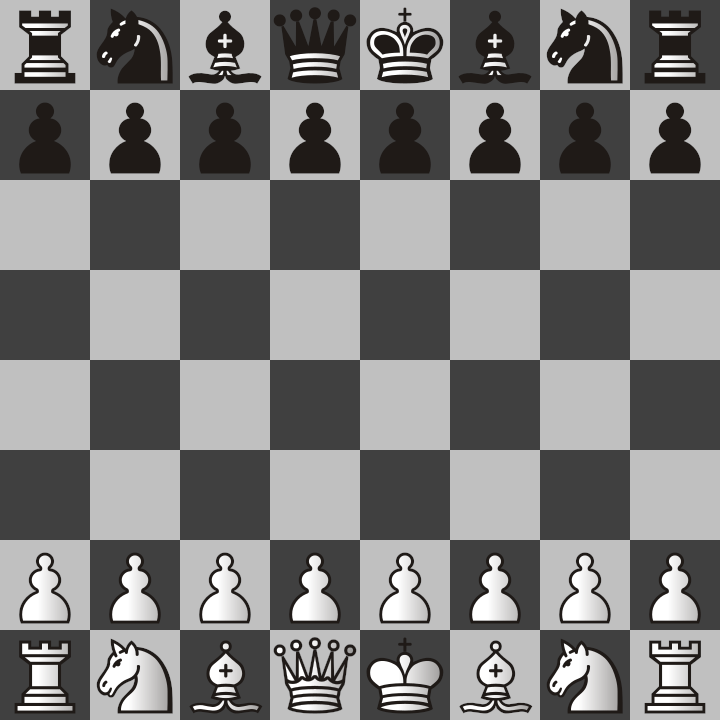
But there are also times when the topic I am discussing or promoting is my business, Chastity’s Chess Challenge. In this case, I have specific images I also designed for a chessboard image. I have two of them with different colors for the checkerboard background. The first one is black and white which looks more visually pleasing to me. The second, with light and dark shades of gray, is probably easier for others to read. In both cases, they are made for people who are color-blind and only see grayscale anyway. This simplicity in color fits in with the theme of Chess anyway because it is a battle between the white and black pieces.
When it comes to fonts, they all look basically the same to me because I can read the letters and numbers of any font. However, there is a font family called Roboto that I made sure to install on both of my computers because it was part of the official streamer kit on lichess.org. Because Lichess is the site I recommend to everyone for playing Chess online, I decided to start using this font in all of my programs for a consistent look for the text in my Twitch Streams, Word Documents, and art designed in Inkscape. The following image shows what the font variants Normal, Italic, and Bold look like.

Colors are the most exciting part of my creative design. I will not hesitate to use any colors that are relevant to the project, but when it comes to my preferences in color, they can be reduced to the following 8 colors.

The colors in the image above are the ONLY 8 colors possible when the primary colors of light, Red, Green, and Blue are either zero or at their maximum intensity. The following list shows how they can be represented in binary, along with their English names.
000 Black
001 Blue
010 Green
011 Cyan
100 Red
101 Magenta
110 Yellow
111 White
Of course, these 8 colors are not enough to represent all colors that might be needed, not even for the Progress Flag at the top of this post, but they are always my top choices when designing a website.
As an artist, I carefully craft my images to be mathematically precise, and sometimes, this takes priority over how they actually look to other people. While it is important to catch the attention of people when the goal is to promote a message or a product, I would never commit the crime of destroying geometry or compromising on color because people prefer softer colors. I have my values, and I have consistently been using logos and colors like this, so my content has been pretty consistent over the years.

Leave a comment